Why is Nutrition Science so Confusing?

Recently I talked a little about how statistical data can be manipulated. Today I want to show you  how scientific studies can use data to prove something like coffee increases your risk of cancer one week and then reduces your risk of cancer the next week.  The items being studied could be anything, bread, butter, coffee, mushrooms, heck we could even prove that exercise is unhealthy if we scrub the data enough.  Or we can look at different data points and prove that all these things are healthy for you too. 

What is P-Value?

To be published a paper needs to have a p-value less than .05.  I’m not a stats person.  You probably aren’t either, but a p-value of .05 represents that the results being published have less than a 5% chance of it being complete chance.

I Am Biased

We all have some personal biases right?  If someone publishes a study that tells me I should drink more coffee, then I don’t give a ^$%@ if your p-value came in at an 80% chance that the results were rubbish.  I’m gonna start chugging more coffee and feel good about my buzz.

On the other hand if your scientific study is going to tell me that I should stop drinking coffee…  well a 5% chance that the study results are just luck is not going to cut it with me!

HELL  NO!

If you want me to stop drinking my coffee then I want you to have a p-value more like .00001.  I want there to be a 1 in 100,000 odds that the study results were just chance.  But 5% is the standard to be published.  That doesn’t seem super compelling to me.  A 1 in 20 chance that the results of the study were just random or dumb luck?  Give me my damn coffee!

What if we can force the data to give us a proper p-value?

I’m linking to an article that you can read if you wish.  It’s up to you, but I would like you to click through eventually (NOT RIGHT NOW!) and scroll down to the graphic that says “How To Hack Your Way To Scientific Glory”.  The data points in this graphic has economic data going all the way back to 1948.  It seems like it would be a long enough period of time that you can draw conclusions from it, right?

This graphic didn’t work on mobile for me so you may need a computer to check it out and play around with the values yourself.

How Did This Get Political?

This isn’t getting political.  I promise.  It’s just that the resource I found online to prove my point uses p-value, economic data, and compares it to what political party was in power over the time period.

Let's Start Hacking Data To Prove A Point

If you click on the image here you can see that we have a good p-value score of just .02 meaning we can publish these results in a journal.  The data is showing that as long as we don’t take into consideration inflation when Democrats are the dominant political party the economy does “better”.  (Whatever better means).

AH HA!  You see Democrats make the economy better!

Or we can change the data points that we look at.  Now let’s include Inflation, but exclude Gross Domestic Product.  Now we have an even better p-value of .01 and the data shows that when the Democrats are the dominant political party that the economy does “worse”.  (Whatever worse means).

AH HA!  You see now that Democrats make the economy worse!

But what if we look at all the data points?  This third picture shows that the data is all over the place and the p-value is now over 50%.  That’s not anywhere close to .05.  Now my study has no statistical relevance and I can not draw any reliable conclusions.  Or maybe…

AH HA!  The Democrats have no effect on the economy!  (Or maybe my experiment wasn’t any good).

You can keep playing with the data yourself now, but for completeness here is 1 snapshot for the Republicans.

On this picture we have all the data points checked and the p-value is now .81 instead of the required .05.

But if we just throw out a couple variables… (you get the point).

Remember that part about bias?  Some of you probably thought to yourself, “YES! See the Democrats got a .51 p-value and the Republicans got a .81!  I knew the Democrats were better.”

Except both of the data plots proved that they can not be relied upon to draw any conclusions, but some people probably still did.

Let's Get Back to Nutrition OK?

So is coffee going to kill me or help me live forever?

Well I hope that through the exercise above you can see how eliminating or switching data points can give you completely opposite conclusions.

Let’s think about what most nutrition studies are trying to accomplish.  They look at something, in my example coffee consumption, then they apply that to a large population of people and compare it to some sort of health risk or benefit.

How many things are happening inside and outside the human body all at the same time?

  •  The 50 different hormones that are ALL CONSTANTLY signalling our bodies 24 hours per day
  • The 100 billion neurons in our brains (plus or minus a few billion)
  • The 37.2 trillion cells
  •  The 20,000 – 25,000 different genes
  •  What about the exposure to bacteria, air, water, soil, and food contaminants?
  • How about lifestyle differences like alcohol, smoking, recreational drugs, or even exercise?
  • Diet and food consumption
  • What about something like the amount of body fat vs. muscle someone has?
  • How much sleep do we get?
  • How stressed out is the person?
  • Does the person have other health conditions?
  • How many other factors am I forgetting?

Which Data Points Should We Include?

Obviously some of the stuff listed above aren’t relevant and some are depending on what is being studied.  Often times nutritional studies are asking people to recall what they ate.  Sometimes as far back as decades ago.  Besides your food journal can you recall what you ate on May 10th?  How about May 10, 2012?  So studies have to be simplified.  The data points reduced. 

Do you drink coffee? Yes.  How many cups on average?  2 (because if I said 4 I might get judged by the researcher).  And is that 2 cups everyday?  Yes, well usually.

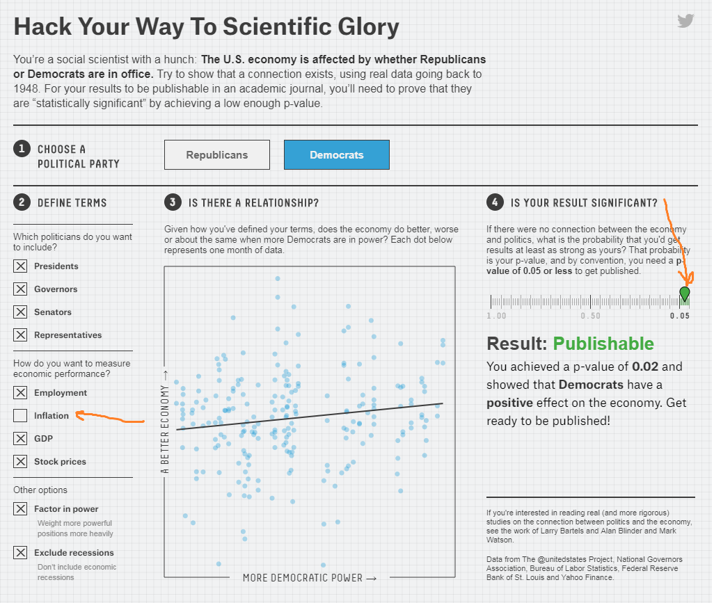
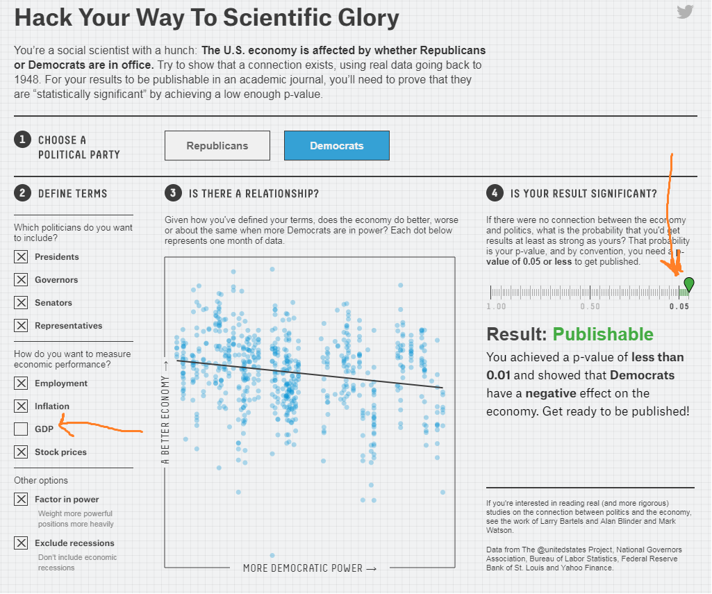
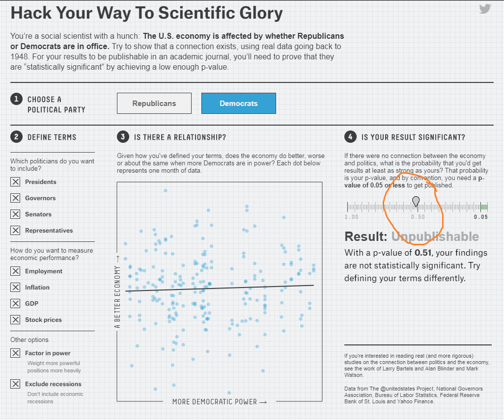
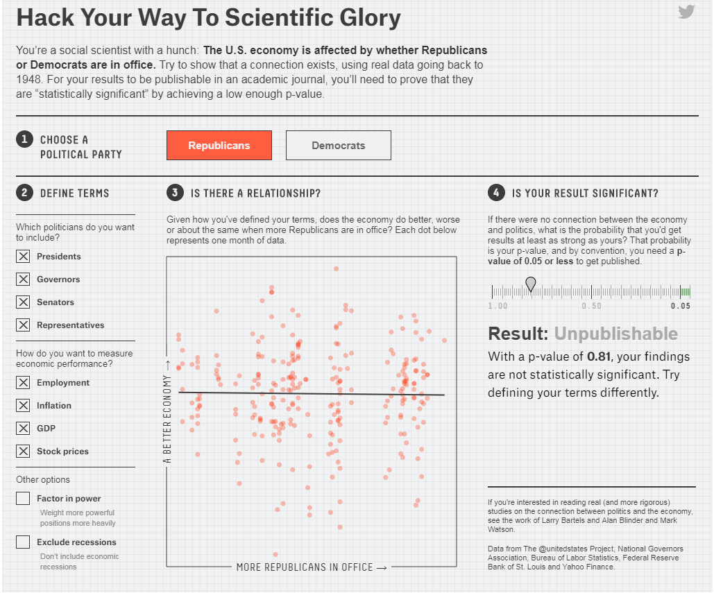
Ok now if we ask enough people that question and then look at their health history we can start drawing conclusions.  But what happened when we started eliminating data points in the graphics above?  What happened when we included ALL of the data points?  The results started looking more and more random, right?

With Nutrition Science Being So Confusing What Should We Do?

The quick answer is go with your gut.  Use the common sense that you know.  Rely on the tried and true nutrition principles that are all well regarded as truth.  What are those you ask?

Eat More:

  • Lean proteins
  • Vegetables
  • Fruits
  • Low fat or no fat dairy
  • Whole grains
  •  Nuts
  • Seeds
  •  Healthy Fats
  • Low calorie high nutrition food

Eat Less:

  • Added sugars
  • Processed foods
  • Limit your alcohol

Do More:

  • Exercise
  • Caloric balance

Let's Wrap it Up for Today

Tomorrow we will discuss a study on coffee that found coffee has a 14% chance of increasing our risk of lung cancer.  The study is done well.  The results are sound.  The conclusions the researchers made are extremely well written.  It’s a good study.  Yet…